I detailed before in this post why we use mlr in the context of the AGROMET project. Machine learning is very powerful to build models.
I will present my methods and my results.
Data preparation
Reshaping data
I have already explained it in my last post but this is an important part of the workflow.
mlr package needs a data frame to work correctly. Then, we need to focus on its preparation. As a reminder, we have static variables and dynamic variables available but they are generated independently. The first step is to group them. To do that, we need to make a join with both of them according their geometry, i.e. their coordinates. Then, we can group them by date and create a nested data frame, i.e. a data frame which stores individual tables within the cells of a larger table. That perserves relationships between observations and subsets of data and it is possible to manipulate many sub-tables at once with some functions. The library purrr is very complete for this. Once your data is nested for every hour.
Define machine learning workflow
Once your data is prepared, you can prepare the mlr workflow.
First, you will define the target, i.e. the parameter you want to predict. Then, you will create the task, i.e. the explanatory variables to use to build the model. Task will be created for each hour, this will be a new column with the same format than the data (sub-tables).
Then, you have to define the learner, i.e. the statistical method to use. In my case, I will used only multiple linear regression. And defining the resampling method, leave-one-out cross-validation is the one I use.
Well, we can run the benchmark now ! Performances and predictions can be extract from it.
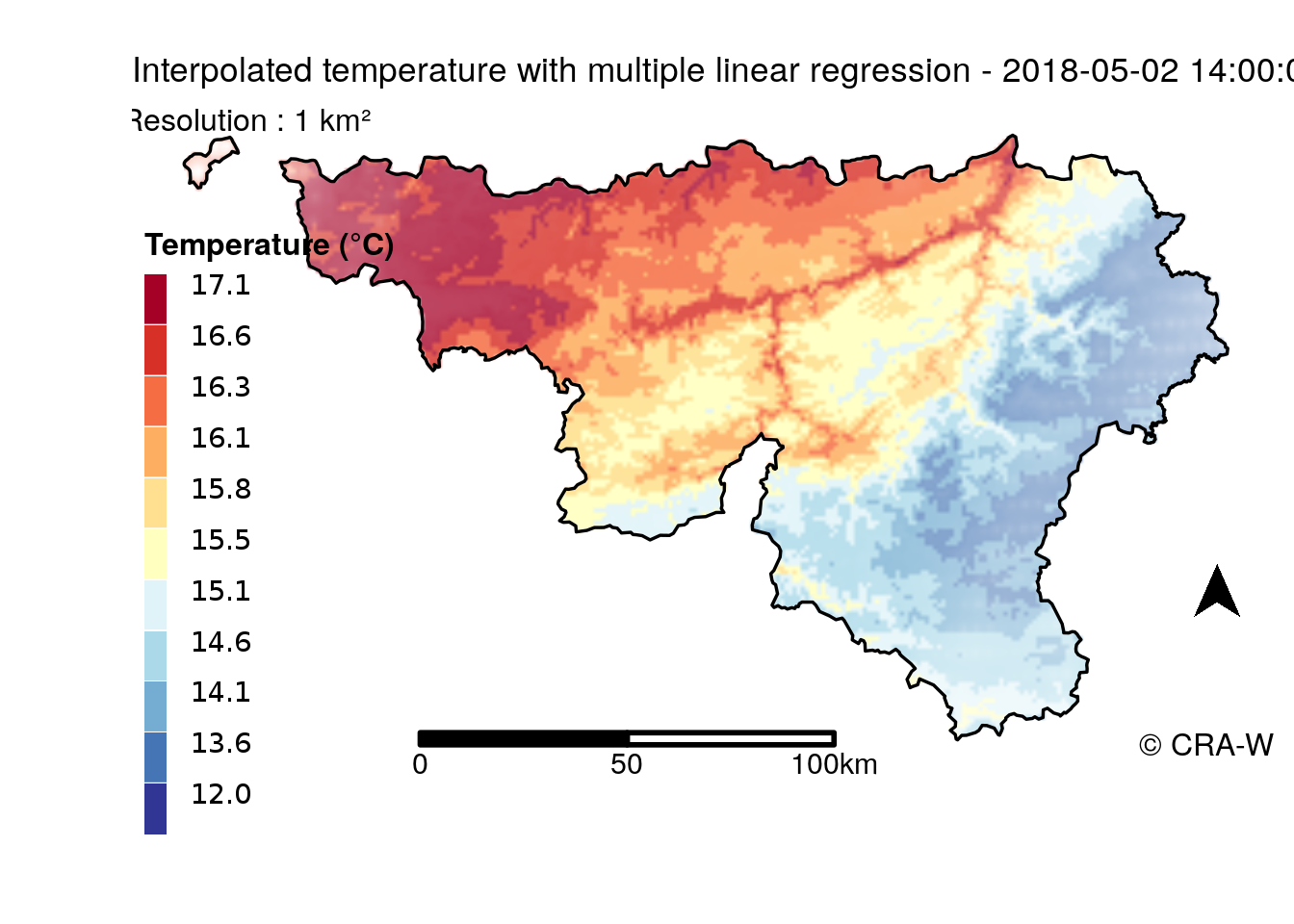
Spatialization and maps
Beyond this, our objective is to spatialize these results. mlr is able to apply prediction on a spatial grid. This prediction is related to its related error and that is possible to be visualizedon a map.
Some computations can be done to create a map. Below, there is a map displaying prediction without and one displaying the uncertainty of the prediction.
Colors do not match because process has been different for the two maps but we can see that uncertainty make some blurred areas.
For the first map (without error), I used tmap to create it. The legend was done from spectrum colors.
In contrast, the map with uncertainty of prediction was more difficult because it needs to display prediction and uncertainty. My method was inspired by this article. The principle was to normalize prediction and error and create a HSV code from these values. Then, the conversion to RGB code attributed a color to each 1 km² cell of the grid. This color takes into consideration prediction and error through color and cleanness of this color.
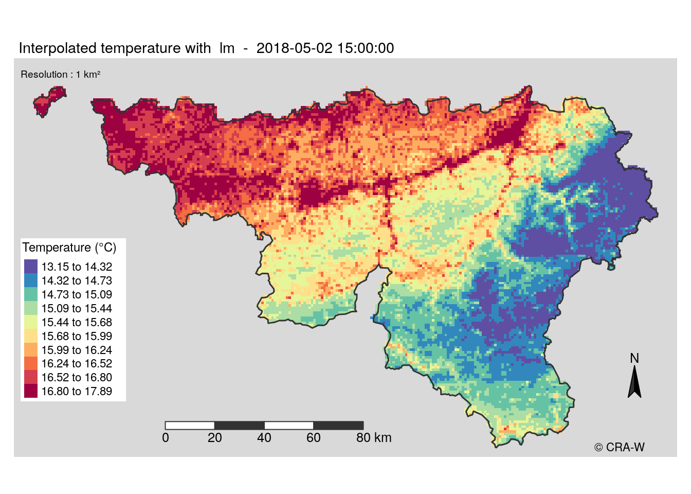
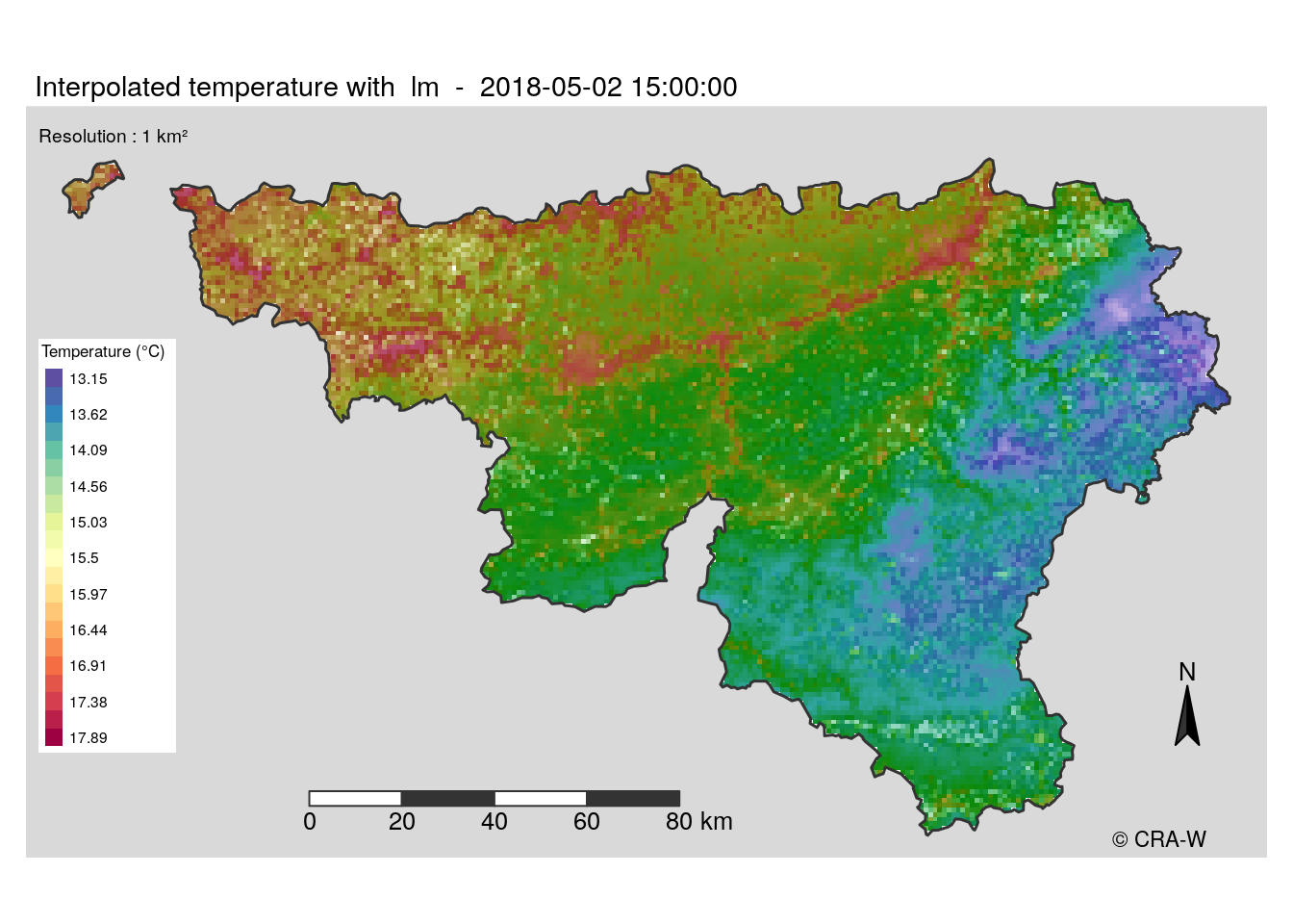
New approach
The maps I made use a spectral palette, which is not very adapted to the display of temperature. Moreover, it is not very clear to understand the map when error is shown.
Another method we condider was to make two distinct layers : one for the predictions and one other for error. The error layer would be a white layer with different transparency levels where opacity would mean larger error. However, tmap can not handle this. That’s why we decided to stop using it and restart the map building with leaflet for interactive maps and with ggplot2 for static maps.
In my case, I worked on static maps. ggplot2 package has a different logic in its code, it was a new way for me to create a map. Finally, the function was ready to build maps giving the coice to display error layer or not. Below a example of map I have produced.